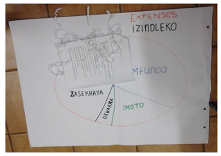
Pie charts are visual methods used to demonstrate the distribution of various resources in relation to others. It can be a useful tool for evaluation and by using non-permeable materials it allows for flexibility, change and correction. By making use of a visual representation it includes participants who are not literate and gives them the opportunity to still be involved. It is even more useful when a language barrier exists between the researchers and participants as the data collected will be diagrammatically represented. In addition to allowing all participants to contribute to the process is it most valuable in obtaining social information.
For the study I am using as an example, the participants were asked to construct two pie charts. The first pie chart represented income, which included any sources from which the participants received their money, the second represented expenses or use of money. The translator (as these participants spoke isiZulu and I speak English) explained the process to the participants and before the exercise one of the researchers and a translator drew an example of a pie chart. As I was inside a hall instead of outside, we supplied the participants with string, prestik, masking tape and stones; however, this activity has been done before with merely sticks and sand.
The income and expenditure pie charts were used to immediately gain information about the use of money in the group. This activity would allow for further discussion based on the results as well as to inform the researchers of the variables of importance from the outset our study.
After explaining the process and leaving the materials with the group, I stepped back and allowed the participants to discuss the task (notice the concept of distanciation in action here). One participant (which we will refer to as Participant 1) took a leadership role and decided to generate a discussion among the group members. The translator and one researcher translated back to the other researchers while the participants were discussing the pie charts.
This exercise can also be used in conjunction with other activities, such as focus groups. This is what I did in my research; I asked the group to first discuss the issue, and then to visualize what they had talked about in the forms illustrated above. As you can see by the illustrations, this activity was very informal and done almost completely by the participants – yet the data retrieved from observing the group as well as the data produced by the charts was vital to this projects analysis.


I love me my pie charts!
ReplyDelete